Pages: 1 2 3 4 5 6 7 8 9 10
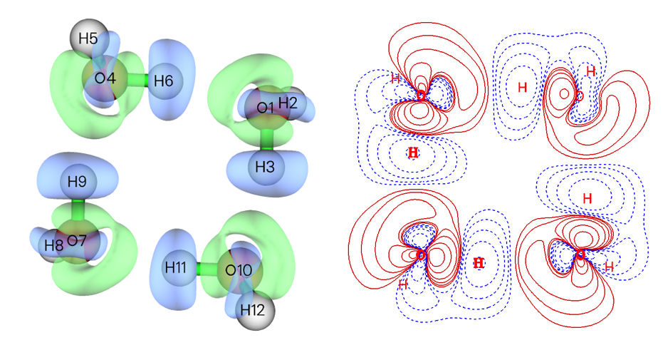
- Isosurface map and contour line map of density difference of water tetramer with respect to its constituent monomers. Red and blue regions correspond to increase and decrease in electron density after formation of the tetramer, respectively. See Section 4.4.8 of the manual on how to plot this map.
-
Isosurface map of LOL-pi function of a segment of carbon nanotube. The favorable delocalization paths of pi electrons are very clearly
revealed. See Section 4.100.22 of the manual on how to plot such a map.

- NCI analysis for urea crystal. Color-filled RDG isosurfaces are shown in the graph. This picture vividly reveals spatial regions and types of weak interactions (green or brown = dispersion interaction, blue = H-bond). The graph was plotted by VMD based on the data generated by Multiwfn. See Section 3.22.1 of the manual on how to plot such kind of map.

- NCI + AIM analysis for 2-pyridoxine 2-aminopyridine. The NCI map (color-filled RDG isosurfaces), AIM critical points (yellow spheres) as well as bond paths (orange lines) are simultaneously shown to fully characterize the intermolecular interaction. The graph was plotted by VMD based on the data generated by Multiwfn. See Section 4.20.1 of the manual on how to plot this map.

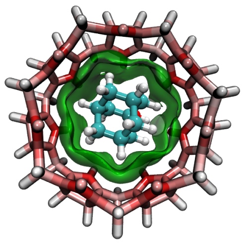
- Independent Gradient Model (IGM) analysis for a host-guest complex. The green isosurface represents the weak interaction region between the host and guest. The color of the atoms in the host molecule exhibits atomic contribution to the interaction, the more red the larger the contribution. The graph was plotted by VMD based on output files of Multiwfn. See Section 4.20.10 of the manual on how to plot such kind of map.
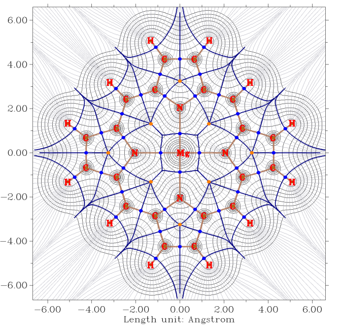
- Gradient map of electron density with contour lines of magnesium porphyrin. Brown, blue, and orange circles denote (3,-3), (3,-1) and (3,+1) critical points, respectively. Dark brown lines depict bond paths, dark blue lines reveals interbasin path. See Section 4.4.6 of the manual on how to plot such kind of map.
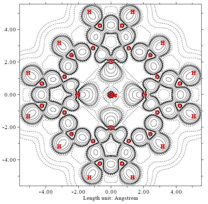
- Deformation electron density map of magnesium porphyrin. The solid and dash lines represent the regions where electron density is increased and decreased during formation of chemical bonds, respectively. See Section 4.4.7 of the manual on how to plot such kind of map.
- Total / Partial / Overlap density-of-state (DOS) map of ferrocene. For clarity, isosurfaces of corresponding molecular orbitals were appended on the graph by external tools. See Section 4.10 of the manual on how to plot such kind of map.

- Minima (blue spheres) and maxima (red spheres) of average local ionization energy (ALIE) on van der Waals surface of phenol. The location of minima above and below the conjugated ring perfectly explain the effect of hydroxyl as an ortho-para directing group. Minima 8 (at backside) and 9 correspond to the lone pairs of oxygen. See Section 4.12.2 of the manual on how to carry out this analysis.

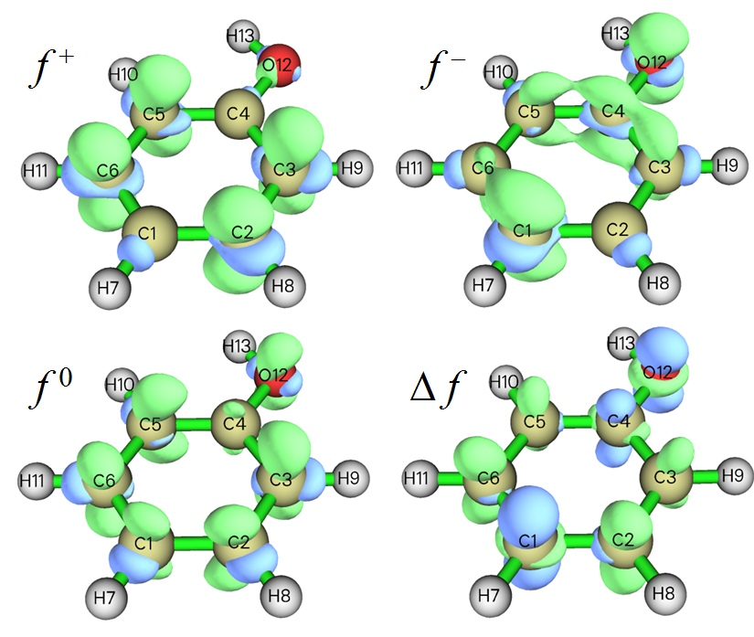
- Isosurface map of various kind of Fukui functions (f-,f+,f0) as well dual descriptor (Δf) of phenol. Positive and negative regions are represented as green and blue colors, respectively. Since in the f- map, the net amount of Fukui function distributed on para- and ortho- carbons is evidently more positive than the meta- ones, the para- and ortho- carbons should be the favorable sites of electrophilic reactions. See examples in Sections 4.100.16 and 4.5.4 of the manual on how to plot this map very easily.
Previous Page Next Page