Multiwfn forum
Multiwfn official website: http://sobereva.com/multiwfn. Multiwfn forum in Chinese: http://bbs.keinsci.com/wfn
You are not logged in.
- Topics: Active | Unanswered
Pages: 1
#1 Re: Multiwfn and wavefunction analysis » Help with Displaying ESP Extrema Values on van der Waals Surface » 2025-09-23 03:01:49
Dear Prof. Tian,
I sincerely thank you for your guidance, quick responses, and for patiently correcting me along the way. Your advice has been inspiring and very helpful, and it allowed me to better understand and successfully carry out the ESP visualization. I truly appreciate the time and effort you have given to support me.
With gratitude and best regards,
#2 Re: Multiwfn and wavefunction analysis » Help with Displaying ESP Extrema Values on van der Waals Surface » 2025-09-22 03:10:23
Thank you for your guidance regarding ESP visualization. I tried to follow the tutorial in Section 4.A.13, but it relies on VMD 1.9.3 and commands (pt, ext, iso) that are not available in any VMD versions I could access (1.9.1, 1.9.4, and others). I also tried on several computers, but the commands still did not work. Therefore, it is not possible to reproduce the tutorial exactly on my system.
To obtain the final figure, I instead generated the surfanalysis file and cube file in Multiwfn and wrote a simple VMD script that displays:
The molecule in CPK
The electron density isosurface at 0.001 a.u., colored by ESP
Spheres at maxima and minima from the surfanalysis file
This workflow was validated on smaller molecules (0.001 a.u.) and works correctly, producing meaningful and reproducible results. For larger systems, the same parameters result in open surfaces with holes and single-color rendering, despite correctly generating the cube and surfanalysis files. This appears to be a technical limitation of VMD’s surface representation. Only using a slightly higher isosurface value (e.g., 0.015 a.u. or above) in VMD produces a visually closed surface
However, the locations and relative magnitudes of ESP maxima and minima are still reliable, so the chemical information remains valid.
Thank you for your consideration.
Best regards,
#3 Re: Multiwfn and wavefunction analysis » Help with Displaying ESP Extrema Values on van der Waals Surface » 2025-09-21 16:41:27
Help with ESP Isosurface for previous molecule
Dear Prof. Tian Lu,
I want to generate the ESP isosurface at 0.001 a.u. for my 56-atom system, but the surface is open around the molecule, with holes, and the isosurface color is uniform (all white, gray, or light blue) — no red/blue ESP zones appear (see fig). my calculated ESP values are within -0.06 to 0.06 a.u.
I also tried other isovalues (0.0015, 0.002), spacings (0.20, 0.25 Å), and adjusted the color range (-0.06 to 0.06 a.u or other like -0.07-0.07) to make red and blue appear, but it still always shows one color. For smaller molecules, the same settings (0.001 a.u., 0.20 Å) worked perfectly.
Could you advise how to generate a fully closed red/blue ESP isosurface for this larger system?
Thank you,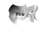
#4 Re: Multiwfn and wavefunction analysis » Help with Displaying ESP Extrema Values on van der Waals Surface » 2025-09-19 16:29:17
Here are the details of my calculation:
Multiwfn version: 3.8
Commands used / steps:
Loaded .fchk file in the Win exe
Chose 12 for quantitative MEP analysis
Set grid spacing 0.2
Pressed 0 to start calculation
After completion, pressed 5 to get the PDB file
Pressed 2 to get surf.cub
Pressed 13 to get the grid data of mapped function (this step is the longest and causing the problem)
Operating system: Windows 10
Basis set / Method: DFT B3LYP/6-31+G(d,p)
CPU: Intel Core i3 (2 physical cores, 4 logical processors), but Multiwfn is running with the default single core
Molecule size: 56 atoms
Grid spacing: 0.2 Å
Thank you very much for your help.
Best regards,
#5 Re: Multiwfn and wavefunction analysis » Help with Displaying ESP Extrema Values on van der Waals Surface » 2025-09-19 15:06:59
Thank you for your quick reply
I am now calculating grid data of mapped function (MEP) in Multiwfn 3.8 for a 57-atom molecule, grid spacing 0.2. In my previous try, it reached 50% after 8 hours, but I stopped it because I thought there was a problem.
Can I make it faster?If the calculation takes more than 16 hours, are the results still correct and reliable for analysis?
Best regards,
#6 Re: Multiwfn and wavefunction analysis » Help with Displaying ESP Extrema Values on van der Waals Surface » 2025-09-18 17:04:05
Subject: Help matching ESP extrema values to positions
Dear Prof. Tian Lu,
I generated the ESP extrema spheres in Multiwfn and viewed them in VMD.
I tried using a Tcl script to print each sphere’s coordinates and values, but I only get errors like “expected integer but got '' ”.
Could you please tell me how to match each sphere with its ESP value, so I can label them manually in Microsoft PowerPoint as you suggested?
Thank you very much.
Best regards,
#7 Re: Multiwfn and wavefunction analysis » Help with Displaying ESP Extrema Values on van der Waals Surface » 2025-06-14 13:34:37
Thank you for the clarification about adding labels manually.
I’d like to ask one more thing: in your publications, how do you decide which extrema points to show and which to omit?
Do you apply a threshold (e.g., only showing ESP values >±15), or do you choose a fixed number of top values (e.g., top 3 or 5 positive/negative)? Or is the selection purely based on visual clarity to avoid overcrowding the figure?
Also, do you filter those points manually, or do you use a script to select and reduce them before labeling?
In my case, for example, I noticed that in the previous reference pic (Fig. 1), the author displayed only 8 extrema values clearly and cleanly, while in my attempt (Fig. 2) using the same molecule, many values appeared — often overlapping or placed on top of each other.
So just to confirm: do you mean it’s fully optional for the user to select which extrema to keep and display, purely based on clarity and visual presentation, not necessarily based on a strict scientific rule?
Your advice would really help me finalize my figure. Thank you again.
#8 Re: Multiwfn and wavefunction analysis » Help with Displaying ESP Extrema Values on van der Waals Surface » 2025-06-09 09:16:39
Dear Prof. Tian Lu,
Thank you for your response.
As requested, I’ve attached figures to illustrate the problems I’m encountering:
Figure 1: This is taken from a reference article. The ESP extrema values are very clearly displayed, well separated, and placed on top of the surface, with labels such as “backside” and arrows used to indicate positions that are not directly visible. Global extrema are also marked with an asterisk *.
Figure 2: This is my result using the same molecule as in Figure 1, for comparison. As you can see, the labels are overcrowded, many are stacked on top of each other, and several are buried inside the surface, making them unreadable. Even limiting the display to top 3 or 5 extrema doesn't resolve this — they still appear unclear or inside the surface.
Figure 3: This is from another publication. This author displayed many extrema values, not just 8 like in Figure 1, but the figure remains clean and readable, with good use of spacing, arrows, and asterisks for emphasis.
Based on these comparisons, I would like to ask:
How can I achieve a clear figure like in these references, where extrema are clearly shown on the surface, not buried inside?
Do I need to limit the number of displayed values manually to avoid overcrowding, or is there a more systematic way to select which extrema to show?
How are elements like “backside” labels, arrows, and asterisks typically added — in VMD or via post-processing tools?
Any guidance or recommendations you can provide would be greatly appreciated.
Best regards,
#9 Multiwfn and wavefunction analysis » Help with Displaying ESP Extrema Values on van der Waals Surface » 2025-06-07 10:28:09
- smile
- Replies: 16
Dear Prof. Tian Lu,
I hope you're doing well.
I’m visualizing MEP mapped on the van der Waals surface using the suranalysis.pdb file. The colored potential surface, isosurface, extremas sheres, and CPK model all display correctly — but I’m having trouble with the clear visualization of the ESP extrema values, which I need for a publication-quality figure.
Here are the main issues and questions:
I’ve tried displaying all extrema, as well as only the top 3 or 5 positive and negative. But in all cases, the values either appear buried inside the surface or are overlapping heavily, making them unreadable and cluttered.
I’m unsure how extrema are typically selected for display in articles:
Based on threshold values (e.g., >±10, 15, or 20)?
Based on proximity to functional groups, heteroatoms, or hydrogens?
Or purely based on visual clarity?
Is the selection typically done manually (by removing or hiding labels), or is there a script-based way to handle it?
In some publications, I've seen the use of the “backside” label for certain extrema. When I tried this, the label appeared on all values — is it usually manually assigned?
Some articles show 2D arrows pointing to hidden extrema (e.g., on the rear side of the surface). Are these added inside VMD, or with external tools like Illustrator? Would that affect the image resolution?
I also attempted to use cones in VMD to point toward buried extrema but couldn't get it to work well — any advice?
For label coloring, should all values use a single color (e.g., black), or should positive and negative values be colored differently (e.g., red and blue)?
Everything else in the visualization looks good — the ESP zones, isosurface, and molecular model all render as expected. I just need guidance on how to clearly and selectively display the ESP extrema values to finalize the figure for publication.
Thank you very much for your time and support.
Best regards,
#10 Multiwfn and wavefunction analysis » Trouble Following MEP+VDW Surface Visualization in VMD » 2025-04-15 14:49:38
- smile
- Replies: 1
Hi,
I'm trying to follow this tutorial to visualize MEP on a van der Waals surface using VMD and Multiwfn:
? https://www.youtube.com/watch?v=QFpDf_GimA0 But I got invalid command errors in VMD like iso, pt, and esp.
So I tried the second method, loading the files manually in VMD:
I exported surfanalysis.pdb, geometry.pdb, and mapfunc.cub from Multiwfn (from options 2, 5, 13).
I load them in VMD manually, but I have problems:
I can set isovalue to 0.001 or 0.002 in VMD
But the color scale range (e.g., -0.002 to 0.002) resets to 0 unless I use larger values like 0.01
The isosurface appears:
In one color only
Or with overlapping red/blue
Or broken with holes unless isovalue is ≥ 0.01
I tried different grid spacings in Multiwfn (0.2, 0.15, 0.1) — no success. Also tested VMD versions 1.9.1, 1.9.3, and 1.9.4.
Help Needed:
How to fix the color scale reset issue?
How to get a closed transparent red–blue surface at isovalue 0.001?
Is there a custom VMD version with iso, pt, esp commands like in the video?
Any working .tcl script or .vmd template for this setup?
Thanks in advance!
Pages: 1